Why Spark is a game changer in Big Data and Data Science
This second part of this post is technical and requires an understanding of a classification algorithm.
The Business Part:
Hadoop was born in 2004 and conquered the world of top-end software engineering in the Valley. Used primarily to process logs, it had to be reinvented in order to attract business users.
In 2014, I noticed a shift in the industry with the ascent of “Hadoop 2.0”: More approachable for business users (e.g. Cloudera Impala) and faster, it is bound to overtake Hadoop as we know it. Spark has been at the forefront this revolution and has provided a general purpose Big Data environment.
Hadoop Spark comes with a strong value proposition:- It's fast (10-100X vs. Map Reduce)
- It's scalable (I would venture in saying that it can scale for 99.99% of the companies out there)
- It's integrated (for instance, it's possible to run SQL / ML algorithms in the same script)
- It's flexible
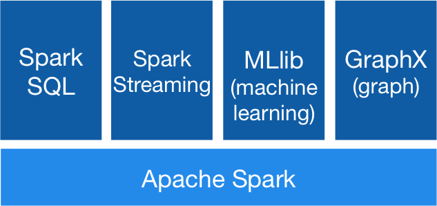
Spark's Components- (Credit: spark.apache.org)
The flexibility is a key differentiator for me. SQL is an excellent language for data management but is quite restricted and does not allow complex aggregation queries. Spark does. Plus, Spark has 3 language API (Java, Scala, Python) in order to cater to a larger audience. It seems that the lesson was learnt from Hadoop 1.0 which was only be appealing to Software Engineers with excellent command of Java.
Because of all of the above, I see Spark as "Big Data for the masses". Data Scientists can use this tool effectively.
Now, let's get our hands dirty to demonstrate the flexibility point. We will be using Spark Python API.
The Technical Part:
Let's assume we have a big classification model trained with Spark ML Lib. Unfortunately, some performance measurement are not implemented so we need to figure out a way to compute efficiently the ROC Curve using all our 100M+ datapoints. This rule out scikit-learn or any local operation.
 |
| ROC Curve Credit: Wikipedia |
Step A: Identify the Inputs:
The performance will be measured on the training set. The data can be shaped into you have 2 columns: Actual labels and model prediction (between 0 and 1):
labelsAndPreds = testing.map(lambda p: (p.label, model.predict(p.features)))
Note: map apply the function to each individual row of your dataset (named RDD in Spark).
This is how it looks like:

In order to draw this curve, you will also need the points on it (aka. the Operating Thresholds). These are level of sensitivity of the classification algorithm, from 0 (it would flag everyone ) to 1 (no-one). Let's generate this list and send a copy to the slaves ("broadcast" in Spark's lingua):
operating_threshold_bc = sc.broadcast(np.arange(0,1,.001))
Here is the strategy moving forward:

Step B: Define the class “ROC_Point” and its behavior:
The ROC_Point represents 1 point on the Receiver Curve. We will create a Python class to store the important information necessary to locate the ROC Point.

The code looks like that:
The class has 2 methods:
- The initialization that we will use in a map statement: For instance, ROC_Point(True,True) will return an instance of the class with 1 true positive, the 3 other being 0.
- The aggregation (“reducer”) that can return 1 ROC_Point from 2 ROC_Points. Basically, a way to tally your KPIs during the aggregation
Step C: Apply the logic:
1- Map Job:
For any operating threshold, we initiate a ROC_Point this way:
ROC_Point(label>0.5,prediction>threshold)
Looping over the list of operating thresholds, we get to:
labelsAndPreds_Points = labelsAndPreds.map(lambda (label,prediction): [ROC_Point(label==1,prediction>threshold)
for threshold in operating_threshold_bc.value])
Let's look at the results:

labelsAndPreds_Points.take(1)[0][0].printme()

We can see that the ROC_Point has properly saved the information and we're now reading for the aggregation.
2- Reduce Job
Now we will utilize the reducer we created.
For each threshold, I will add the 2 ROC Points together, summing their tallies (of FP,TP, FN,TN:
labelsAndPreds_ROC_reduced =
labelsAndPreds_Points.reduce(
lambda l1,l2: [ ROC_1.ROC_add(ROC_2) for ROC_1,ROC_2 in zip(l1,l2) ] )
Let’s look at the results:
This is when the algorithm flags everyone:

At the other opposite, this is when the algorithm does not flag anyone:

In 2 lines of code, we managed to calculate the ROC curve. Quite succinct, a real improvement over Hadoop 1.0!
3- ROC Curve
Now we need to draw the curve (the data is now sitting into your leader node and it will run locally):

Conclusion:
Although still in active development with a lot of changes and improvements to be made, Spark is full of potential and it brings enormous flexibility to better and faster get to the Insight hidden in your data. I recommend keeping an eye on this up-and-coming tool. Specifically, I think Spark will be a game changer for Data Science and can encroach on R in the coming years. Note that MLLib attempt to keep the synthax consistent with scikit-learn which makes it easy to transition for the Python fans. What would be outside of the realm of possibility in R or would have taken hours to compute is now within reach with Spark.


Comments
Post a Comment